After one full semester of art class I learned so many new techniques throughout the drawing, painting, and ceramic units. I learned how to use different perspective, use shadows and highlights, crosshatch, create radiating lines, how to create and glaze ceramic pieces and so much more :) ! My favorite projects for me this year was sketching portraits and doing watercolor! I also thought it was fun doing the perspective room drawings. I have really learned a lot of techniques this year and I will continue to use these new skills to expand my art style. I really want to become an illustrator and/or graphic designer when I'm older, so taking this art class has been really good preparation in fulfilling my dream :). I will totally be taking art class next year, too because it is really amazing!
 This is the fired version of my ceramic cup. I do admit, I didn't get much of a chance to glaze it because I actually couldn't find it for the longest time! One day I put it on the shelf, then today I found it hidden in the bottom shelf- oh well ;) ! Anyways, I didn't get to complete this but that's okay I guess...:)
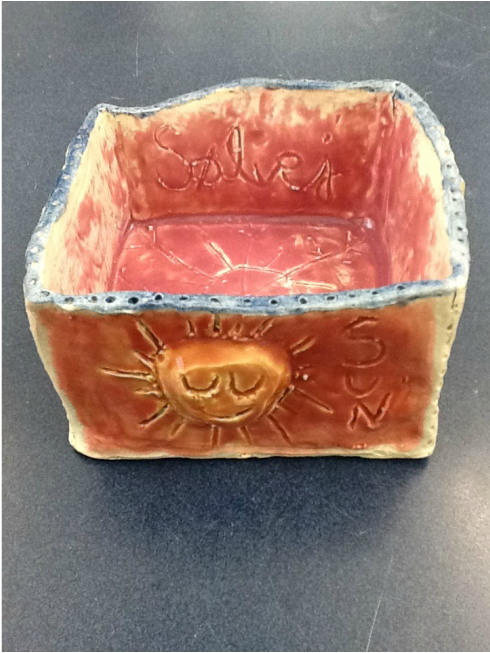 This is the final product of my ceramic box. I used orange, pink, blue, yellow, and green paint for glazing it. I do admit, I think I might've added too much layers of ceramic paint because some sides ( especially the middle) appears to look a bit runny since the paint isn't very consistent and covered evenly. This ceramic box project has taught me of glazing techniques. This ceramic box has a spontaneous, cheerful, and carefree look to it.
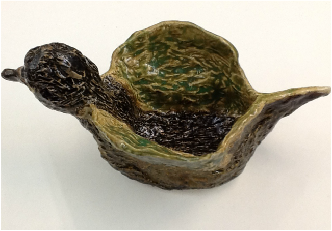 This is the final product for my ceramic duck. This was defiantly a learning process for me when I was glazing the duck because I had never done this before! I feel like I did okay for the first time glazing, though next time I will not over do the clear glaze. By applying too much clear glaze, the consistency of the paint appeared blobby. I used brown for the body, green for the wings, and dark brown paint for the duck's head. I feel like the ceramic duck has a bit of a peaceful look to it.
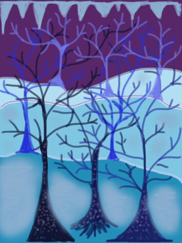 This is a spooky tree drawing that I made on Sketch Book for the iPad. I generally used a 15-20 opacity for the paintbrush tool to create a middle ground, fore ground and background using different shades of blue such as navy, indigo, and sky blue. Then for the sky I used a deep purple to create a eerie and mysterious feel. Finally, I added about a dozen leafless, dead trees with different shades of blue and then added light polka dots to soften up the severity of the trees. I feel like this picture demonstrates the idea of wonder, whimsicality, and what is considered out-of-the-ordinary.
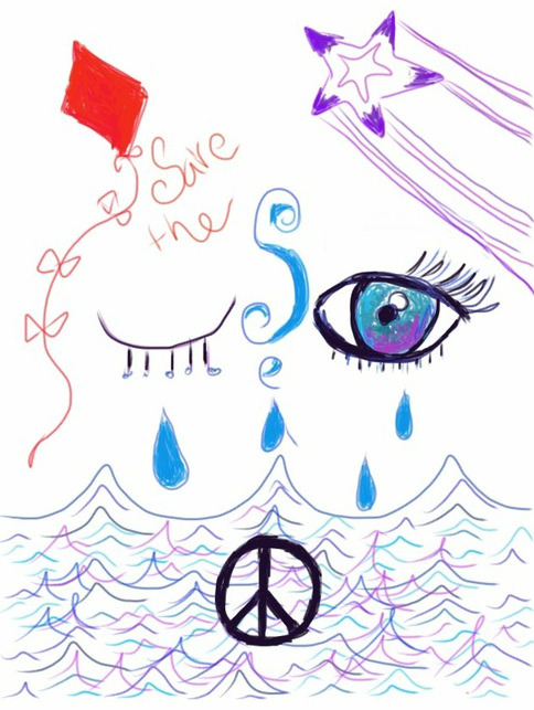 This is an original sketch that I made on Sketch Book on the iPad. I used shades of blue, purple, and a little bit of red and black with 10-20 pen opacity pen tool. The meaning of this picture is that the ocean is truly beautiful and not everyone seems to appreciate it. Unfortunately the ocean gets polluted and radiated from our garbage and nuclear power facilities. The eye represents the ocean's spirit and the tears are from being poorly treated and taken for granted by us, humans. The kite represents potential and new beginnings, meaning we could stop this tragedy from getting worse than it already is. I hope this drawing inspires people to treat the world around them with the kindness and respect that it deserves.
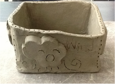 To construct the box, I first got a slab of clay and used a rolling pin to flatten it out. Next, I placed a 3x5 inch notecard on the flattened slab of clay and sliced four squares using a pin tool to get a clean edge. After that, I cut the edges of each square at a 45 degree angle and scored it using a scoring tool. Then, I lifted each of the ends upright and smoothened and secured the box with a thin layer of wet clay. Finally, I decorated the box with excess pieces of clay and used a variety of tools to create unique designs. The theme of the box was weather patterns.
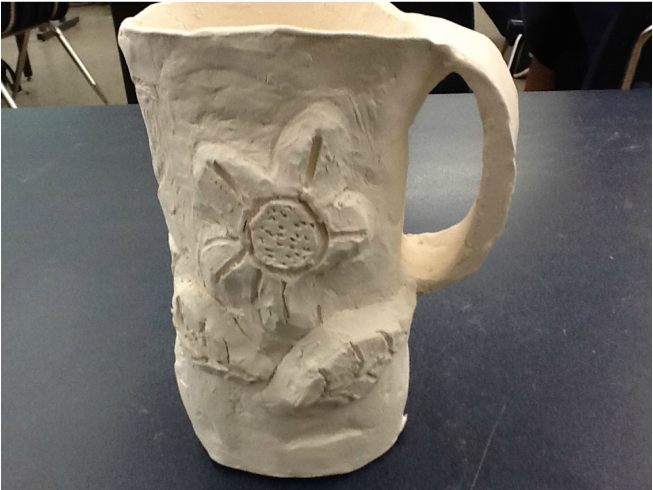
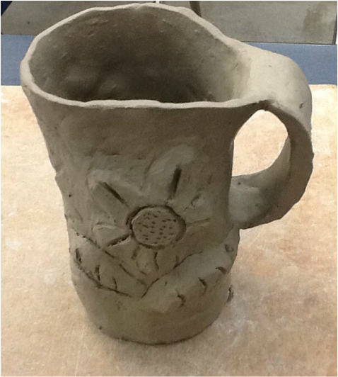 This is a ceramic cup. To create this, I first got a slab of clay and flattened it out with a rolling pin. Next, I placed a cup upon the clay and applied pressure to it to create the appropriate shape. Afterwards, I cut the cup outline using a pin tool. Then I attached each end of the clay together and used the excess clay to form the bottom of the cup. To secure my cup, I smoothened a thin layer of wet clay along the edges so that it wouldn't fall apart. Finally, I cut out a handle and attached it to the cup while adding a flower design on it.
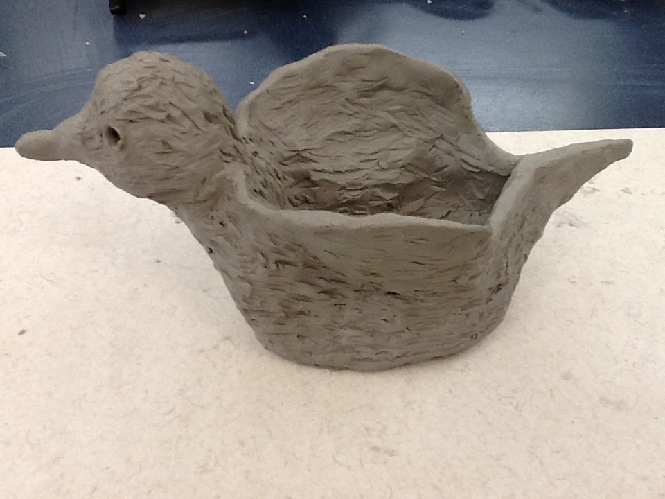 This is a ceramic duck that I created at it's beginning stage. To create the ceramic duck, I first got a slab of clay and rolled it into a ball. Using a pinch pot like base, I then added a head, two wings, and a tail. To make the duck appear to have feathers I used a variety of tools to create lines all over the duck except for on the beak. Finally, I applied a thin layer of wet clay into the cracks so that it was properly sealed. The Duck is hollow in the middle because I wanted to store pens and pencils in it :) ! This ceramic duck appears to look a bit cartoon-like.
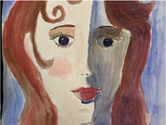 This is a shadow face portrait. Quite honestly, I haven't worked with shadows on a portrait, but for now, I hope I can get better at it in the future! Anyways, to make this I used shades of pink, red, brown, and blue watercolor. On one half of the face I used dark blues to create a shadow effect for the eyes, lips, and nose. I learned how to prevent the paint from bleeding through the paper with controlled and steady brush strokes. This picture appears peaceful and content.
| AuthorI am really passionate about art and hope to become a graphic designer when I'm older. I love to play guitar, bike ride, sing, and draw in my free time. :) ArchivesJanuary 2014 Categories |
 RSS Feed